How are U.S. Treasury bonds holding up?
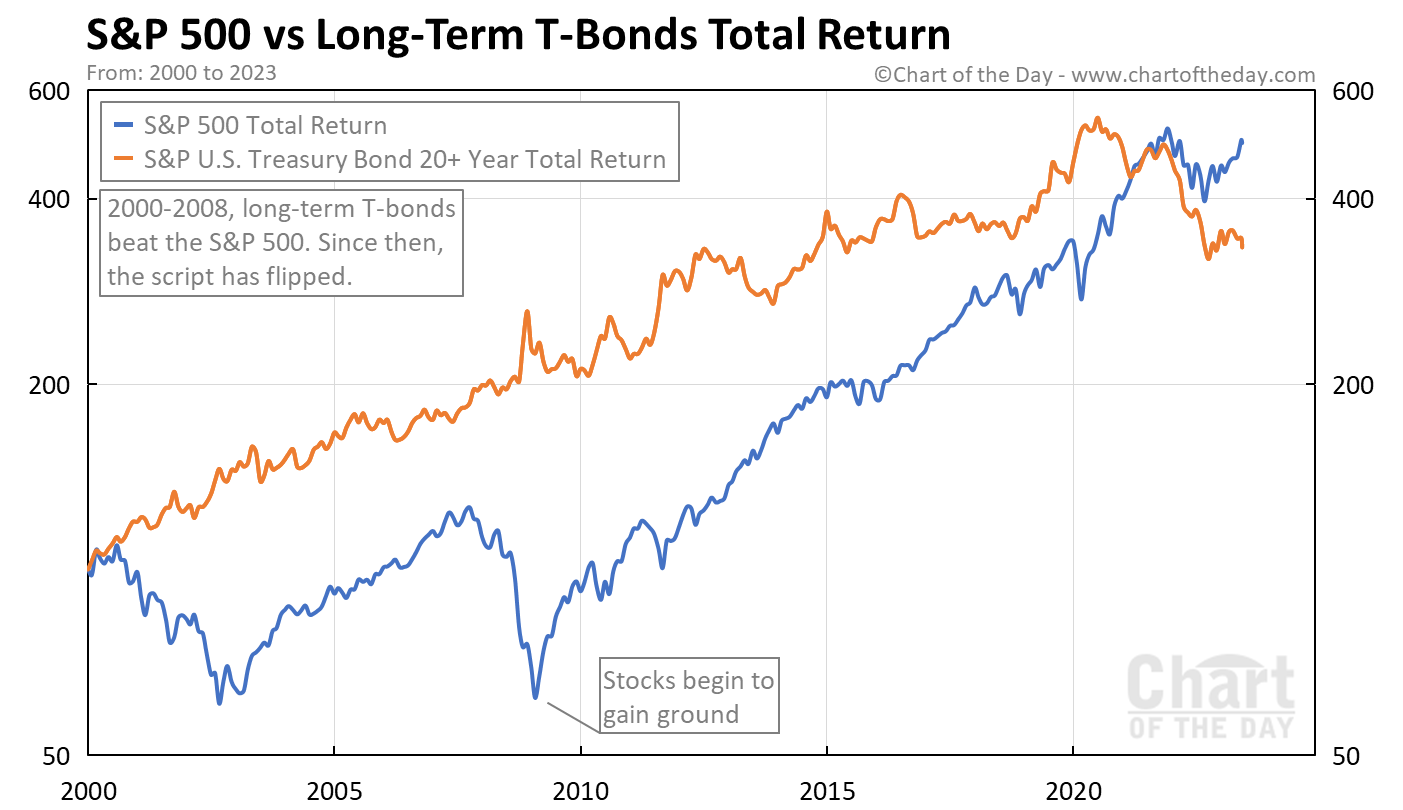
Today’s chart answers that question by presenting the total return trend for both the S&P 500 and S&P U.S. Treasury Bond 20+ Year Index.
Today’s chart illustrates that, from 2000-2008, U.S. T-bonds (orange line) outperformed stocks (blue line) and with much less volatility.
Since 2009, however, stocks have outperformed.
Of note… T-bonds have gained a rather modest 27% since 2009.

