So how has Warren Buffet’s Berkshire Hathaway been performing?
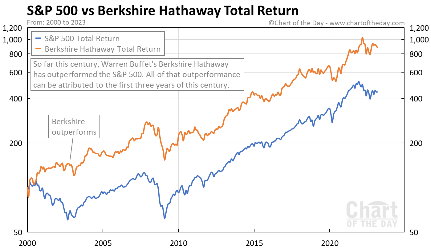
Today’s chart answers that question by presenting the total return trend for both the S&P 500 and Berkshire Hathaway.
Today’s chart illustrates that, so far this century, Berkshire Hathaway (orange line) has outperformed the S&P 500 (blue line).
Of interest, all of that outperformance occurred during the 2000-2003 timeframe.

